Domino’s Next-Generation
Ordering Platform
Web | iOS | Android
A ground up redesign of Domino’s signature online ordering platform and app for next generation of smart devices.
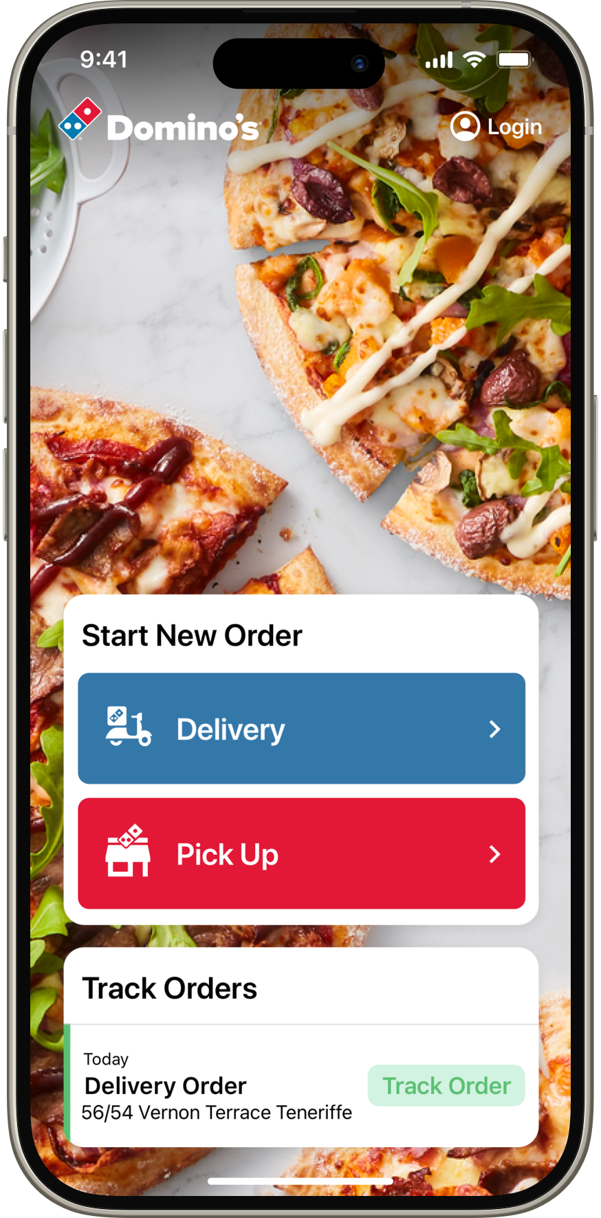
Start Your Order screen featuring live order tracking.
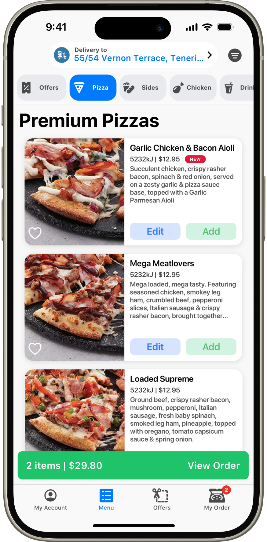
Product Menu showing tabbed navigation and the quick-access bar at the top of the view.
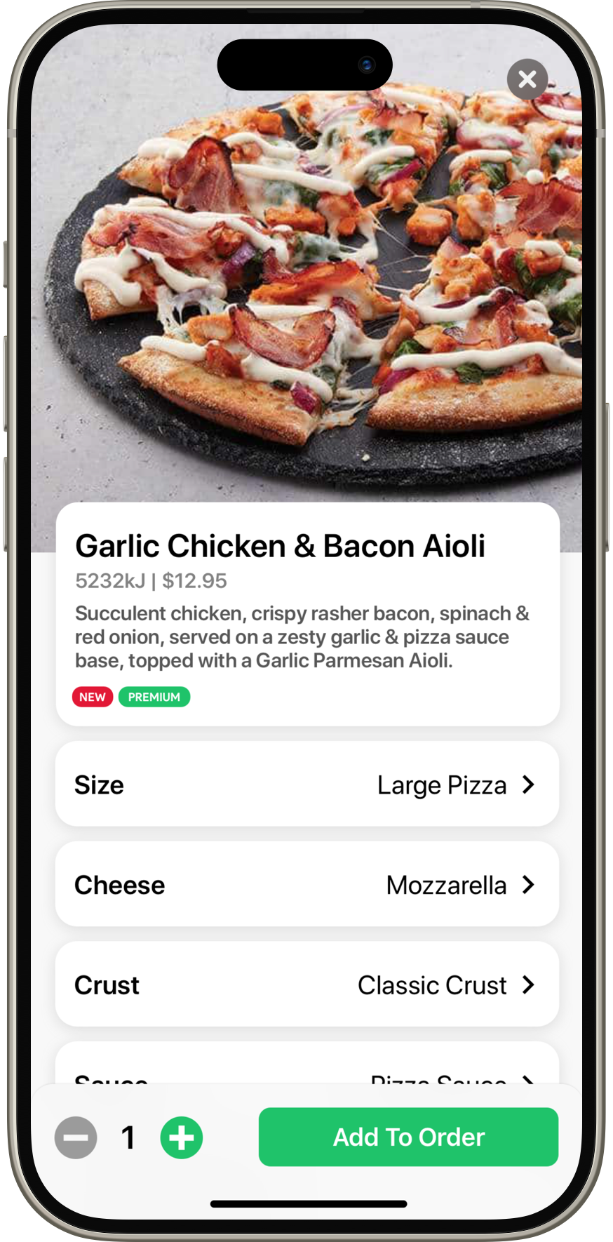
Product View. This shows how the complexity of the product is dramatically reduced by the card metaphor, whist retaining clarity around what the current state of the product is.
Research
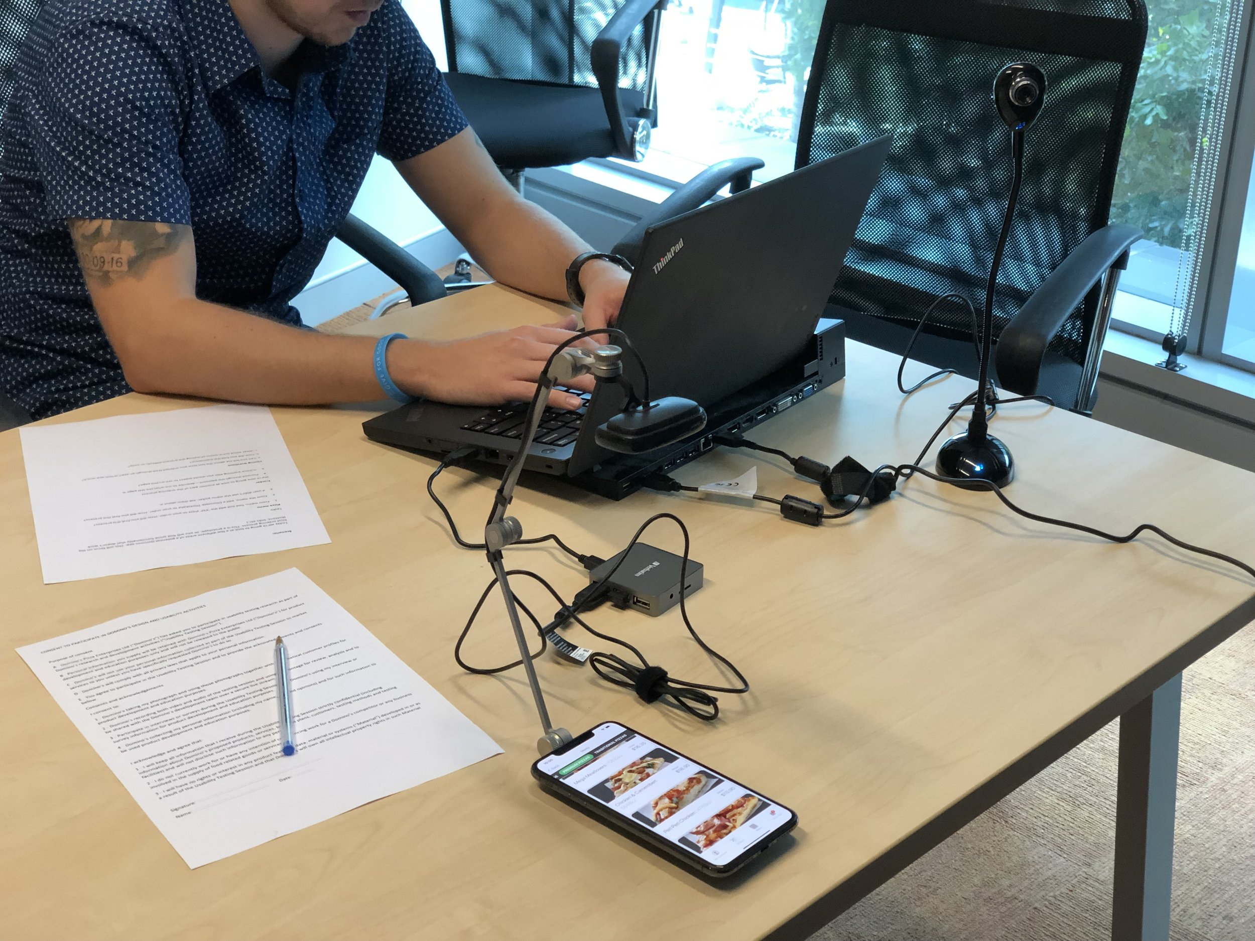
An intensive, 18-month user research and iterative prototyping phase was conducted, with in-house, hands-on user testing of mid-to-high fidelity mockups kit bashed in Keynote and played back on iPad.
Testing was documented through a multi-angle video and screen recording process alongside interviews and in the moment user reflections. Prototypes and user flows were rapidly iterated on between sessions based on this feedback and then re-tested to validate.
This was an opportunity to re-consider every element of the prior platform - down to running a multivariate test to understand which presentation angle and background colour for product images was most desirable to our customers.
As new UI conventions were solidified, they were tested inside the previous generation ordering experience via VWO A/B testing, allowing us to demonstrate positive impact on conversion prior to any development taking place, empowering leadership to confidently endorse the design approach.
During the development phase, larger group user feedback sessions were conducted onsite to validate the execution’s alignment with my research.
High fidelity mockups of key flows built in Principle were presented to the business to get buy-in on the design direction. This was a process of communication - listening to concerns and explaining the “why” and research process that had led to the decisions made. Any substantial changes were negotiated between markets and prioritised accordingly.
Design
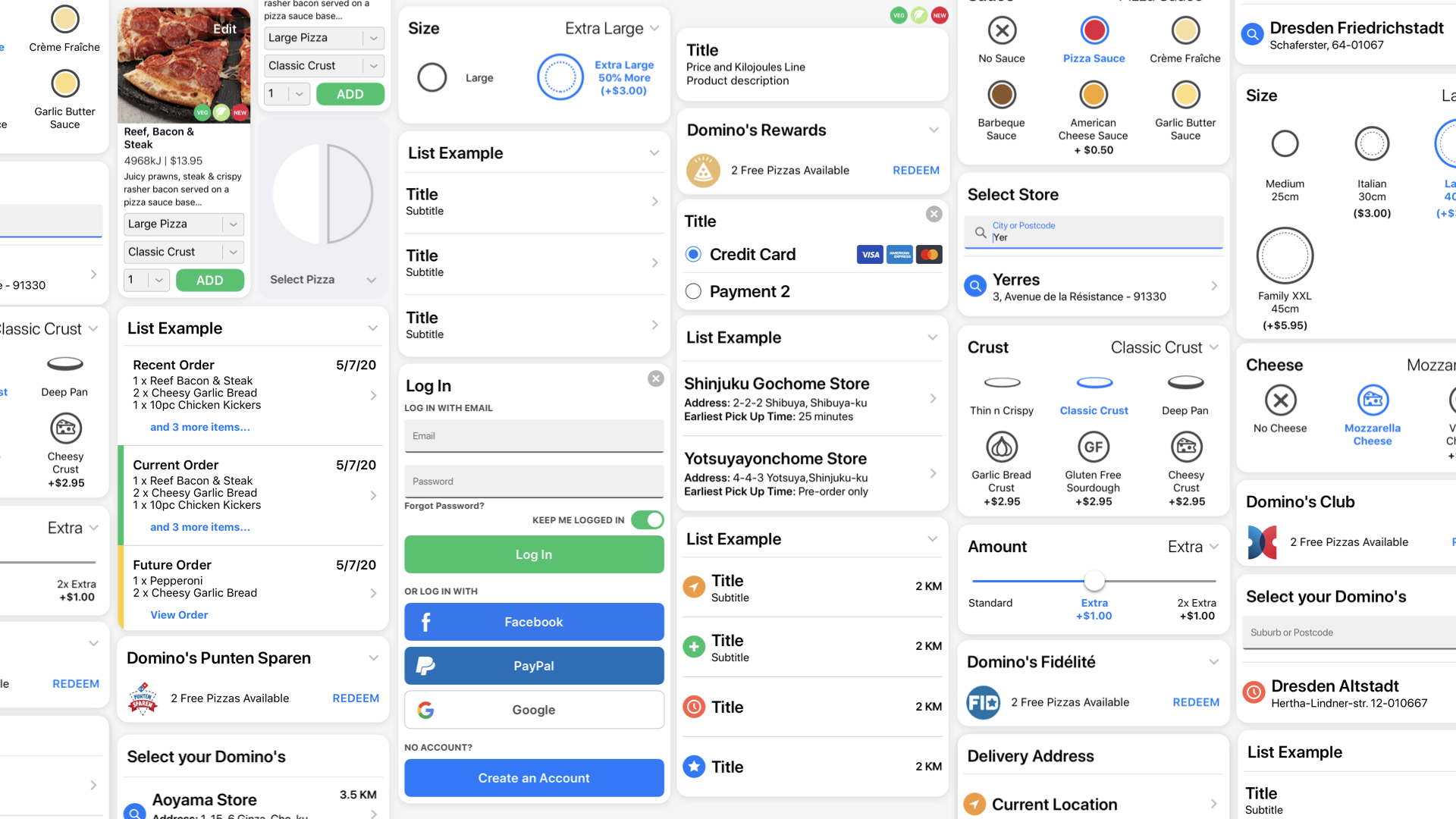
As this was a ground-up design, user flows, user interface, controls, iconography and core platform conventions would need to be built out. Anticipating a growing future team, and planning rapid-iteration workflows lead to the creation of a core Sketch library of UI components and UX structures.
The key to breaking the UX was the card metaphor.
It allowed the complexity of editing a product to be simplified into a series of decisions displayed as expandable cards. If a user wasn’t interested in customisation, the card acted as a friendly confirmation of state. For those looking for customisation options, a simple tap slides the card open, and making a selection acts as conformation, closing the card and updating the state. This reduced the initial complexity of the product enormously, reducing cognitive burden and moving common customisations above the fold. The pop-in, pop-out interaction dramatically reduced the number of interactions required to make a customisation, and the clear states gave the user confidence that their selection was acknowledged.
The card metaphor grounded the entirety of the UX, giving a clear structure to data throughout the app. Cards crucial to progression, such as service or time selection were intentionally created without the pop-in pop-out structure to ensure user input, but for instances where visual confirmation alone was required the card structure saved valuable real estate and reduced the cognitive stress of the ordering process. Once validated through both in-hand user testing and as a multivariate test in the legacy user experience via VWO , I could assure the business that this was the path forward. The card metaphor was the bedrock we could design the platform around, comfortably supporting multiple languages across thousands of scenarios.
Simply native
The neutrality of the design language was important when considering a multi-platform approach, with closely aligned user experiences across Mac/iOS, Android and Web.
Consistent UX conventions across platform makes it easy for customers to move from the web experience to the app - retaining an existing understanding of how the platform works.
Minor interface variations were made to adopt platform conventions for corner radii, system fonts and colours.
One of the core goals for this project was to move users from mobile web to the app, where they could have a more feature-rich experience - such as robust user accounts, advanced location services, and platform integrations like Live Activities.
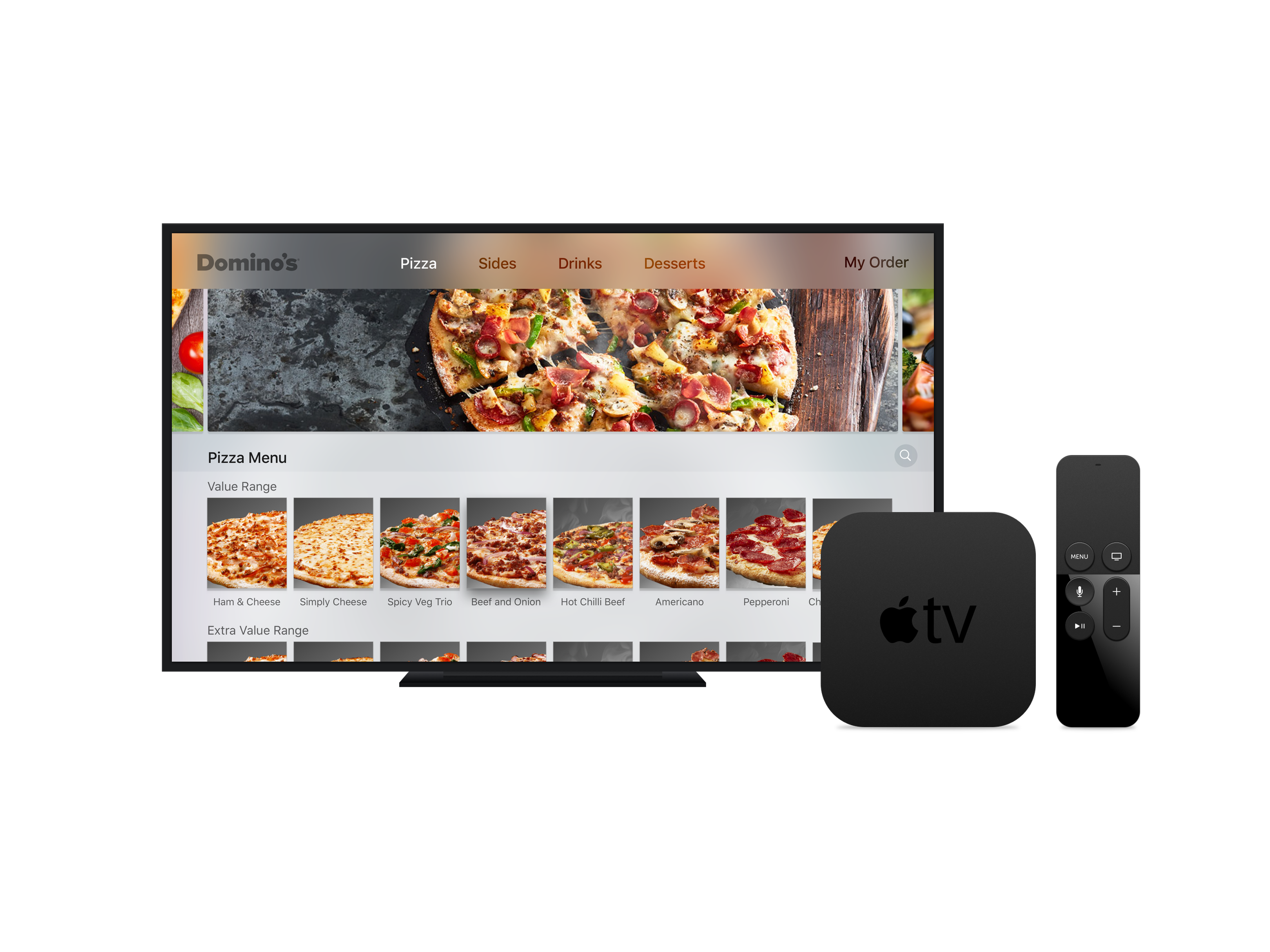
Form factor support was crucial, with the need to give desktop web and tablet users an experience that took advantage of the greater available real estate, while also feeling consistent with the mobile web and app flows.
The result unfurled familiar cards and UI components beautifully across a large canvas.
A truly global platform
Key to all considerations was the internationality and localisation of the experience. This was critical as the design was going to be deployed across the globe, from Japan to France to Australia. Long and short strings of text - and text in kanji (and more common for the brand, katakana) would need to be considered for legibility and line breaks.
Deployment &
Testing
To maximise our testing scale, an internal beta was rolled out, replacing a lunch ordering web portal. All DPE employees from store teams to CEO were encouraged to give feedback, and sessions were held onsite to capture this.
Change logs were posted throughout offices to keep teams aware of updates and to let them know feedback was being actively actioned. This process continued through 8 months of development and was crucial to getting in-the-moment feedback.
The Next Generation experience was rolled out as a web experience in Asia-Pacific and some EU markets initially, with traffic split between it and its immediate predecessor. Usertesting.com and VWO were used to monitor conversion and make any immediate changes to support a transition the business could be confident in.
Development
Developed during the Covid-19 pandemic, across changing team landscapes - including the transition to both internal and multiple external development partners, I had to ensure designs were delivered to support a relatively ambiguous schedule.
Working with DPE’s internal project management team I mapped out features for prioritisation, and we moved to co-ordinate resources to - as far as possible - support this agreed upon structure.
This was enabled by moving to Sketch Cloud for all designs - meaning I could supply links and early mockups that devs could examine to understand scope and update those living documents prior to a formal kickoff to that feature.
We also received positive feedback that this communication gave developers a greater insight into the process, helping build empathy as we moved together at pace.
Results & Post Release
For those customers using the new experience, conversion increased 12-20% during the first month of testing.
This gave the business confidence to rapidly roll out web and app across all markets, with the final market, Japan, coming online 8 months later (due to support requirements for many regional third party payment platforms).
Sales were boosted substantially, with the new experience being largely responsible for online sales breaking $3 billion for the first time ($3.06 billion, but why quibble) - 63% sales growth over two years. The new experience also led a surge in online vs in-store/phone sales, with three quarters of sales now coming from online platforms.
Post-release, I pushed forward with feature enhancements, new features and new form factors.
Features included:
Enhanced transition animations
Refreshed menu designs with bigger images and less up-front text.
App-wide dark mode support on iOS, Android and Web
Drop-pin delivery to any set of coordinates
A refreshed delivery tracker with native, platform specific maps integration, including 3D maps on Apple devices.
Integrated deals and offers specific to the order type.
Revised payment flows with Apple Pay checkout from the menu.
Live activity support
New form factors included:
iPad specific views including overlays and native side-menus
Better support for full screen displays
Foldable form-factor support with multiple bespoke views and updated Material 3 components
In-store kiosk support with integrated POS checkout flows
Additionally, I assisted in the development of an in-house A/B testing function to quickly validate and implement new designs across web and app platforms.

